Saturday, March 28, 2015

the Book Beautiful in New Zealand


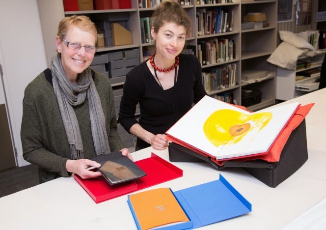
the photo is by Mark Beatty, and here Ruth Lightbourne, Curator of Rare Books at The Turnbull Library, Wellington, and Melissa Bryant, a Master of Information Studies student at Victoria University and a recent intern at the Turnbull show some of my books (Jenson's Greek by Loney, Lullaby by Ross Brighton, and Mondrian's Flowers by Loney and Max Gimblett which was published, not by me but by Granary Books, New York) - the books are part of The Book Beautiful exhibition running from 2 March to 22 May 2015 -  "selected by Ruth Lightbourne, Curator of the Rare Book Collection, this beautiful and exquisite grouping includes medieval manuscripts, early hand-printed works from the 15th century, the finest examples of the 19th and early 20th century private press movement, embroidered and jewelled bookbindings, and more. A New Zealand section features a specially commissioned work by Auckland printer Tara McLeod of the Pear Tree Press" - 

the term 'book beautiful' is derived of course from the essay The Ideal Book or Book Beautiful by T J Cobden-Sanderson (Doves Press 1900), in which he elaborates a set of ideals in the fields of Calligraphy, Typography and Illustration toward 'The Book Beautiful as a Whole' - I don't have a copy of the Doves Press publication, but a reprint from The Arif Press of Wesley Tanner (Berkeley 1972) - a small volume nicely printed in 500 copies, 350 'sewn in wrappers', 150 'hand bound in boards at the Press' - I wonder if, because Cobden-Sanderson's essay was written just over 100 years ago, a kind of philosophical update might be worth a try, when the world itself and the book within it have changed so dramatically since then - Doves Press was to my mind a far more accurate guide to the future of the book & of type design than was anything by William Morris, even tho Morris was the more influential thinker about the fate of the book against the procedures of industrial production in the late 19th century and the role of craft in the face of industrialisation - so it's nice to see Cobden-Sanderson recalled in the Book Beautiful, and in New Zealand as well, as far geographically from the so-called centres as can be imagined - if you can get to the exhibition, go to it - 

Thursday, March 19, 2015

Daidalos lives!


yesterday, a serious-looking box arrived thru the post with the words ‘Codex Foundation’ noted on the packing slip – it contained the much-awaited Alchimie du Verbe project : a set of 26 signatures of & by 26 book artists from all over the world, all hinging in one way & another, as stimulus or counter-stimulus, to the poem by Arthur Rimbaud having this title – if one was looking for a snapshot of the life & health of the book as a work of art, then this collection has everything – most of it based on letterpress printing, but others relying on linocut, wood-engraving, photography, digital printing, and one work done solely as writing in pencil – a brilliant register of the spread of bookish possibility, from the craft-based artisan at one end of the spectrum to the wit of the conceptual artist at another end – to quote from Peter Rutledge Koch’s introduction to the collection: “To celebrate the 10th anniversary of the CODEX Book Fair and Symposium, the Codex Foundation commissioned 26 printers and book artists from eight countries to contribute a single signature to a printers’ assembling and exchange entitled Alchimie du Verbe. The project, designed to support the work of the Foundation, is a compendium of the printer’s art ranging from examples of fine press printing and typographic experimentation to the avant garde – an assembling representative of the collective genius of the CODEX International Book Fair.” –

my ‘favourites’ I will keep to myself, but I want to list everyone here, and for the most part, googling their names will allow more to be seen from each one (the order is purely alphabetic) : Walter Bachinski & Janis Butler, Victoria Bean, Karen Bleitz, Carolee Campbell, Aaron Cohick, Crispin Elsted, Nacho Gallardo, Martha Hellion, Sarah Horowitz, Mikhail Karassik, Peter Rutledge Koch, Patricia Lagarde, Clemens-Tobias Lange, Alan Loney, Peter Malutzki & Ines von Ketelhodt, Russell Maret, Rick Myers, Didier Mutel, Robin Price, Harry Reese & Sandra Liddell Reese, Dmitry Sayenko, Veronika Schapers, Gaylord Shanilec, Johannes Strugalla & Francoise Despalles, Richard Wagener, Sam Winston –

for my own work in the project, I wrote & printed a new poem with Rimbaud’s poem very much in mind – here’s the cover – 


Saturday, March 14, 2015

new book from Cordite Books


here's the cover spread of my first 'commercially published' book of poetry since Day's Eye, Rubicon Press, Canada in 2008 - it continues my Notebooks, tho they have not been continuously issued - the first instalment was Sidetracks : Notebooks 1976 - 1991, Auckland University Press 1998 (copies still available thru AbeBooks.com), and the next is Melbourne Journal : Notebooks 1998 - 2003, as yet unpublished - the current title Crankhandle comes from a friend's request for poems to publish in a venture that didn't materialise, but I had said to him that I'd be happy to "crank out a few poems " for the purpose - and there's a mechanical relationship (however dubious, however distant, however tenuous - perhaps the real & sole connection is the writer's role as cranky crank dwelling outside the mainstream!) between the crankhandle of my first car, a 1930 Plymouth, which I occasionally had to crank into life, and the handle of the handpress which is a constancy in printing on the Albion - the present book will be published in April, and no doubt it will be launched somewhere, so I'll register that information when I know it - here's a bit from Crankhandle


how make it new

of old words
                                                                        time to give
old paper                                                                        meaning
& old pens                                                      the slip
                                                                                          that eyes open
old hands                                                      for the first
& old blood                                                                        time

old books
& old eyes

Thursday, March 12, 2015

&, while I think of it

"do not let the wonder of it get away" - William Saroyan, talking on a recording of him reading from his work I used to have a few decades ago - and, into the bargain, extrapolating from Wittgenstein - and here I am again, also, being Bartleby again - and that via Blanchot - do I have anything whatever to say that doesn't come from another - 

the word is everything
that's in the case


Wednesday, March 11, 2015

the very old is now


a glimpse of Gill Sans Greek as used in Peter Koch's edition of Herakleitos, translated by Guy Davenport, and which type I have just bought from Offizin Parnassia - no lower case, no accents, like most ancient stone inscriptions and papyrus documents, and closest therefore to some of the oldest Western documents we can read - Guy Davenport says Herakleitos's "presence as a spirit in both modern poetry (Eliot, Pound, William Carlos Williams, Hopkins) and modern physics makes him peculiarly a twentieth-century guide" - the type does not have the kind of inscriptional characteristics of ancient stone-cutting that went into the late Dan Carr's wonderful Parmenides metal type (of which I have no picture, I'm sorry to say, and nor does it seem to be available now, and nor does the closest thing to it, Christopher Stinehour's digital Diogenes Greek and the variant Diogenes Text Greek - Gill's Greek is what they call 'monoline' where the line of the letter is the same width thruout, whereas the lines of both Stinehour's & Carr's types are slightly flared at the outer ends, showing a much closer relationship to the original chisel-cut letters from which they are derived - in any case, examples can be seen in one of the great books on book-making in the current era, Carving the Elements : A Companion to the Fragments of Parmenides, with essays by everyone involved: Peter Koch (printer/publisher), Robert Bringhurst (translator), Dan Carr (metal type designer & cutter), Christopher Stinehour (letter-carver & digital type designer), Daniel Kelm (bookbinder), Peggy Gotthold (bookbinder), Richard Wagener (wood engraver) - and while there is no essay by him, Richard Seibert was also a compositor in the project - Gill's Greek, however, remains to my eye very elegant and I look forward to making word in it, then making book - 

Monday, March 9, 2015

fresh type from Parnassus


well, perhaps not quite Parnassus, but certainly Offizin Parnassia in Switzerland (they have, by the way, a splendid type catalog in PDF form you can download) - pictured here is the 24pt Albertus Light I showed back on January 10 - there's something about unused type, a sense, when I look at it, of open possibility, the scope of which will decrease at the precise point when it is put in the press, ink'd, & press'd into paper - the letters of the English alphabet are capable of registering a great many languages, a prospect diminished at the time any one language is chosen - is it similar to the loss of linguistic possibility written about by Daniel Heller-Roazen when he recounts Roman Jakobson : ". . . infants, he maintained, are capable of everything. Without the slightest effort, they can produce any - and all - sounds contained in human languages". And then quoting Jakobson : ". . . the child loses nearly all of his [her] ability to produce sounds in passing from the pre-linguistic stage to the first acquisition of words, that is, to the first genuine stage of language". (from Echolalias: On the forgetting of language, Daniel Heller-Roazen, Zone Books 2005) - is unprinted type like that - full of a total possibility that is erased or at least diminished when it's put to the service of just one or two languages - and if the type one acquires is secondhand, what then, if it was used in one language, to be henceforth used for another - there is of course no memory in the metal that passes over tho some would like to think so - a kind of unrealisable inherence, perhaps - in the transformation of lead type into gold words, the work stands at an absolute beginning, every time new, every time fresh, every time as all time, and no time as part of any sort of sequence - and, listening again to Guy Davenport in 1974 (the year I started to print) : "We are just now seeing, amidst the fads and distractions, the strange fact that what has been most modern in our time was what was most archaic. . . " - along with the Albertus from Switzerland came a quantity of Gill Sans Greek type, in capital letters only, in which both the old and the new are both equally present to sight and to the prospects at hand &, literally, in the hand-setting of type - what's past is present, and the present is ever reaching forward - 


Sunday, March 8, 2015

new book from Carivari in Leipzig

back in the old days of CODEX 2014 in Melbourne, when Sabine Golde of Carivari showed & presented her books at the Book Fair, we found ourselves in conversation about books and about Autumn, her "favourite season", and one possibly more sharply delineated in Germany than our autumn is in Victoria, Australia - during that talk she asked if I would write something, a poem, on Autumn for her, and now the resultant book is available - 
the cover, not the text pages, is a concertina, printed with images of Eucalyptus leaves on both sides of the paper, as the light coming thru in the picture shows - the book is bilingual,  my first ever, in any language, English & German, with the German translation done by well-known translator Steffen Popp - the two languages are differentiated by different ink colors, and placed on the page thus - 

there are 23 copies, 262 x 102 mm (10.3 x 4 inches) - the orange cover slides nicely into a red slipcase, and the price is 70 Euros -